Reflections on Lectures
Part 1 Symbolism and Semiotics with guest lecturer Martin Hosken; Part 2 Case study; Part 3 Patrick Thomas Breaking News 2.0 Installation at the London Design festival
The power of words is especially important in all human cultures and must be thoroughly understood for effective advertising. Regardless of which language is spoken by which people, we are in awe of the impact word choice can have. “The pen is mightier than the sword,” according to English author Edward Bulwar-Lytton. The Persian poet Rumi once said, “Raise your words, not your voice. It is rain that grows flowers, not thunder.”
In today’s fast-paced, digitally obsessed world it can be easy to forget the complexity and fundamental nature of language. Marketers are constantly hearing from social media platforms, designers, and ad agency executives that visual cues matter most. Video ranks the top on social. People love to capture a moment in a photo for a communication impact. The importance is the relationship. The picture is defined in terms of words – not the other way around. Words are the foundation of our understanding. They are the foundation of our communication.
All advertising is a means of communication. Marketers use every media available to communicate a message, story, and emotion to their intended audience. People receive and process each attempt into words. A deaf person learns to communicate with visual words. A blind person learns to communicate with tactile words. It is our words that matter in advertising so that we can achieve the desired result.
Technology and data are being combined to create the most personalized and customized marketing in history. Marketers can know their customers on a very personal level. As this capability advances, marketers must be ever more aware of the power of words and the language used in each media.
The Olympics case study was very fascinating. This kind of country adaptations can also be seen in the FIFA World Cup, where the logos encompassed something from the country hosting the global sports event. I can also think of other famous brands that follow the same process. They provide their usual product and services but create specific products that are only available in that country or relate to that country. Brands include McDonalds, Pepsi, Heinz, Knorr, Maggi, etc. In the Middle East, during the Holy month of Ramadan, these brands create unique Arabic flavors from meals to recipes to sauces.
This activation at the London Design festival was quite fascinating. The audience can engage through technology and express themselves through words or copy. It shows various messages in multiple languages that are expressing various topics globally and languages. Again, we come back to the power of words that brands convey to customers.
Resources
Crow, D., (2003) Visible signs: An Introduction to Semiotics
Chapter 4 grabbed my attention as it talked about Advertising Writing. In advertising, there are six messaging strategies that are most commonly used: emotional, unique selling proposition, generic, positioning, brand image or preemptive.
An emotional message strategy uses feelings to sell. An ad using this tactic should make their target audience feel an emotional connection to the product or brand. The Unique Selling Proposition strategy highlights something unique about your product or brand that others do not offer. What is the differentiated factor that sets your organization apart? What resonates with your prospects? This is the main selling point. One of the best examples of a successful USP is the classic Domino’s Pizza offer of “fresh hot pizza delivered to your door in 30 minutes or less or it’s free.” While no longer offered, this highly specific offering helped the Domino’s brand stand out in a competitive industry by expressing a unique proposition that benefitted the consumer in either scenario. Generic does not mean that you should use uninspired, non-descriptive language in your messaging. When an ad is using a generic strategy, it is focusing on selling the category rather than the specific brand. While the Positioning strategy identifies the product or brand as the best in comparison to the competition. Oftentimes these ads will boast features such as #1 in customer service. Your brand image plays perhaps the most important role in how consumers perceive your brand. It encompasses everything from the colors in your logo to the imagery in your marketing materials. It’s crucial that you stay consistent in your imagery so that consumers think of you when they see it. This strategy creates a personality for a brand and may not always specifically sell a product. Finally, is the choice to use a preemptive strategy. This means that you are choosing to be the first to make a claim about your product or service. This claim may also be true for your competition, but you are the first to tell your target audience about it. Listerine used this strategy in their ads that claimed their breath strips would be like covering up a crime scene.
Workshop Challenge
For this week’s workshop challenge, I decided to choose the case study option two about brands. As a graphic designer working in the advertising industry, I am amazed by brands and how they adapt to different markets and cultures to be relevant to their target audiences. After researching several food brands which are of interest, I decided to investigate the HSBC brand. A while back, I used to handle this brand as an account. It was very interesting to find that this brand adapts according to different markets. One market that stood out was the Saudi Arabian market, one of the biggest markets in the Middle East.
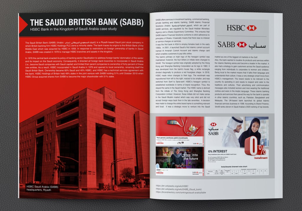
The Saudi British Bank (SABB) (Arabic: البنك السعودي البريطاني (ساب)) is a Riyadh-based Saudi joint stock company in which British banking firm HSBC Holdings PLC owns a minority stake. The bank traces its origins to the British Bank of the Middle East which was acquired by HSBC in 1959. In response to restrictions on foreign ownership of banks in Saudi Arabic, SABB was created in 1978 to manage HSBC branches and assets in the kingdom.
In 1976 the central bank enacted its policy of banking sector Saudization to address foreign banks’ domination of the sector and its impact on the Saudi economy. Consequently, it directed all foreign bank branches to incorporate in Saudi Arabia (i.e., become Saudi companies with Saudi capital) and limited their parent companies to ownership of forty percent of these new entities. As a result, HSBC incorporated in Saudi Arabia in 1978 and opened to local ownership, renaming itself the Saudi British Bank. Ownership became 60% Saudi and 40% HSBC, and HSBC has a technical services agreement with the bank. HSBC Holdings of Britain held 49% stake in the joint venture with SABB holding 51% until October 2019 when HSBC Group acquired shares from SABB to become the major shareholder with 51% stake
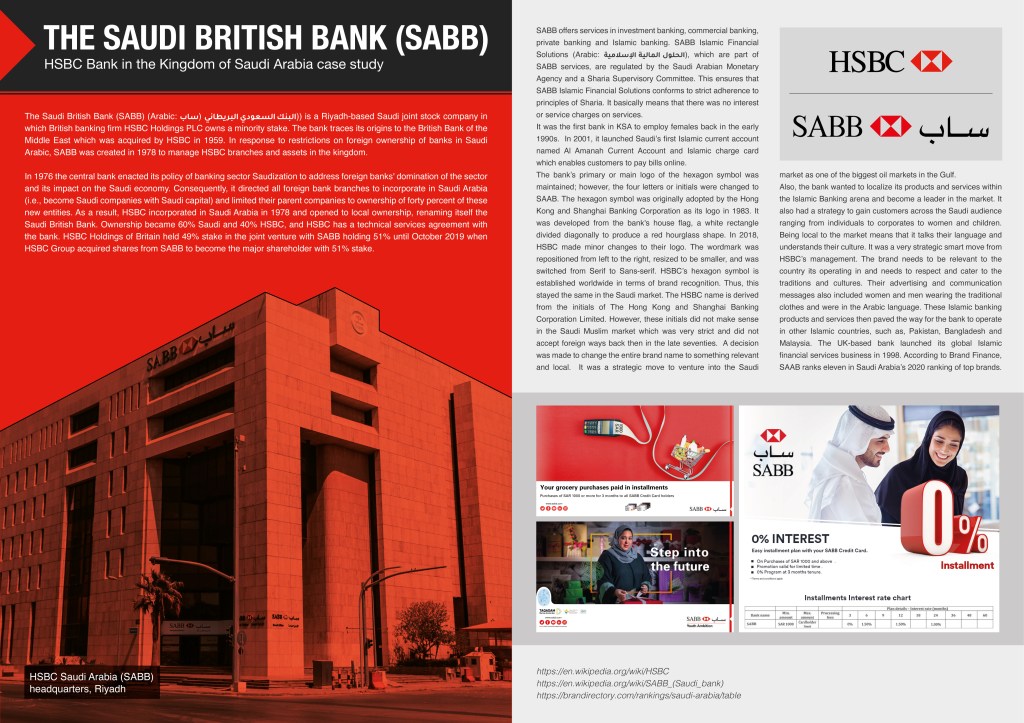
SABB offers services in investment banking, commercial banking, private banking and Islamic banking. SABB Islamic Financial Solutions (Arabic: الحلول المالية الإسلامية), which are part of SABB services, are regulated by the Saudi Arabian Monetary Agency and a Sharia Supervisory Committee. This ensures that SABB Islamic Financial Solutions conforms to strict adherence to principles of Sharia. It basically means that there was no interest or service charges on services.
It was the first bank in KSA to employ females back in the early 1990s. In 2001, it launched Saudi’s first Islamic current account named Al Amanah Current Account and Islamic charge card which enables customers to pay bills online.
The bank’s primary or main logo of the hexagon symbol was maintained; however, the four letters or initials were changed to SAAB. The hexagon symbol was originally adopted by the Hong Kong and Shanghai Banking Corporation as its logo in 1983. It was developed from the bank’s house flag, a white rectangle divided diagonally to produce a red hourglass shape. In 2018, HSBC made minor changes to their logo. The wordmark was repositioned from left to the right, resized to be smaller, and was switched from Serif to Sans-serif. HSBC’s hexagon symbol is established worldwide in terms of brand recognition. Thus, this stayed the same in the Saudi market. The HSBC name is derived from the initials of The Hong Kong and Shanghai Banking Corporation Limited. However, these initials did not make sense in the Saudi Muslim market which was very strict and did not accept foreign ways back then in the late seventies. A decision was made to change the entire brand name to something relevant and local. It was a strategic move to venture into the Saudi market as one of the biggest oil markets in the Gulf.
Also, the bank wanted to localize its products and services within the Islamic Banking arena and become a leader in the market. It also had a strategy to gain customers across the Saudi audience ranging from individuals to corporates to women and children. Being local to the market means that it talks their language and understands their culture. It was a very strategic smart move from HSBC’s management. The brand needs to be relevant to the country its operating in and needs to respect and cater to the traditions and cultures. Their advertising and communication messages also included women and men wearing the traditional clothes and were in the Arabic language. These Islamic banking products and services then paved the way for the bank to operate in other Islamic countries, such as, Pakistan, Bangladesh and Malaysia. The UK-based bank launched its global Islamic financial services business in 1998. According to Brand Finance, SAAB ranks eleven in Saudi Arabia’s 2020 ranking of top brands.
Omar Mal
April 22, 2020
