Critical Reflective Journal – Lecture
This week’s lecture was very interesting. It talks about noticing the unnoticed. Creating something unnoticed into a work of art or design. However, I also see that from another point of view. Sometimes good design details are unnoticed because everything flows together into a piece of work that’s nearly perfect. People always notice the bad designs and the errors.
Good design is something that is easy to use, read and interact with. It makes users want to engage and experience your website, app or physical material and evokes a specific emotional response. As a designer you may spend days, weeks or months working on a project that does not look like anything especially spectacular to those outside the design community, and that is probably a good thing. Good design is pretty much invisible.
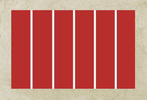
There are many unseen mathematical principles that create harmony. Charles & Ray Eames 1977, Powers of 10 was a video that touched that point using mathematical equations to zoom out and then zoom in. Using grids to create a design outline is one of the most common mathematical tools for designers. By setting up invisible columns or rows in a document to help determine object placement, you create a distinct sense of order. The best grids are created using a sequence of columns (or rows). Different projects require different grid structures. Newspapers, for example, often base their print design on a six-column grid structure; website grids tend to vary more widely and can range from as few as three columns to as many as 16.
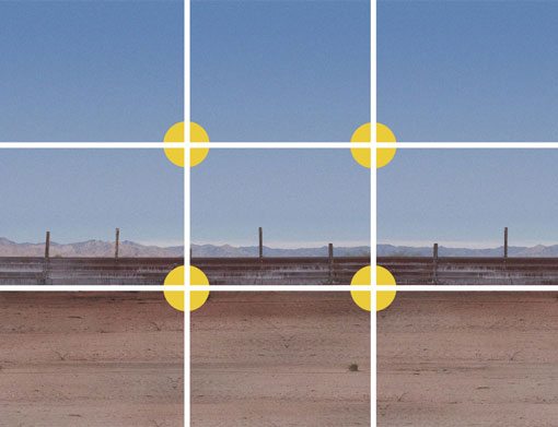
The rule of thirds is one of those mathematical theories that shows up in every printed or digitally published bit of work. Simply, the rule of thirds is an imaginary 3 by 3 grid that fits on top of any image (or design) of any shape or size, where each of the nine rectangles are the exact same size. The theory helps designers (and photographers) determine how the eye follows a single image or group of images (such as a website). It helps determine crops for photos and placement of images in groups. According to the theory, the eye first stops at the upper left intersection, then moves downward, then back up to the right top intersection and then down again. (This is why most designs feature logos and contact information at the top left). The rule of thirds is another tool that helps you create a sense of balance in design. What you may find surprising is that this balance is often asymmetrical. Because the eye falls along intersections in this nine-block grid, there is no center reference point.
John Berger’s “Ways of Seeing” is based on the premise that the way we see things is affected by our knowledge and beliefs. An image is a sight that has been recreated or reproduced. It is a set of appearances, which has been removed from the place and time of its first appearance. I agree with his way of thinking as I usually do not notice things as I am not thinking about them or they are not in my mind. Things get noticed when you are searching or looking for them at that specific moment. It’s all about the mind and the appearances of things around us. What goes unnoticed in our life? We pass our days rushing to finish our daily job and chores and do not notice the beauty of the sun, the weather, the beautiful image of seagulls flying over the sea, etc. We are too preoccupied into our mobile phones and social media news that we get sucked away into this other unreal world of online. You phase out and unplug from the reality.
Resource Materials
This week’s research material is to watch the John Berger film, Ways of Seeing. The main point discussed is the aspect of perspective. That eye was -before the rise of photography- on a unique location in the world. The human eye could only be in one place at a time. People would travel to the image. The camera made it possible that appearances could travel across the world. This perspective makes the eye the cuter of the visible world [1’41’’] The painting can only be in one place at one time, the camera reproduces it. Making it available in any size, anywhere, for any purpose. [18’45”] As soon as the painting becomes transmittable, this meaning is liable to be manipulated and transformed. When paintings are reproduced, they become a form of information. Which is transmitted and so they must hold their own against all the other information which is jostling around them. Example of showing children the painting of Caravaggio’s Jesus: with an open mind one sees easily the ambiguity of the gender identity of the Jesus-figure. Most girls see a female figure, most boys a male figure.
Sketchbooks: The Hidden Art of Designers, Illustrators and Creatives
The book provides a revealing glimpse into the inner workings and private inspiration of creatives from the world of advertising, design, graphic design, fashion design, art, street art, and illustration. Intimate and often unseen, sketchbooks document the sources of inspiration as well as the journey to final execution. They showcase ideas and how these evolve and change into accomplished works. Fresh and spontaneous, their style connects directly with current illustration trends. The material is complemented by interviews where artists explain how they use their sketchbooks and how these relate to finished works. This provides a direct and unmediated insight into the process of research and creation. As designer, my start point of any idea or concept is a quick and simple sketch just to get out my thought. Then from there, I will start creating something digitally. Some sketches come to life while others don’t.
Hara, K. (2015) Ex-Formation
Ex-formation describes how little we really know, and it becomes the starting point for any type of design. The book describes what ‘ex-formation’ can look like in design practice and how this concept alters our classic understanding of information design. It continues to explore the void, absence, and indeterminacy in contemporary design through the vision of one of the undisputed icons of modern design. ‘Ex-formation’ is opposite to the familiar ‘information’, which means exploration of the unknown.
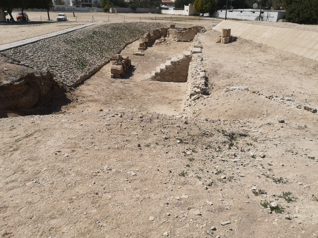
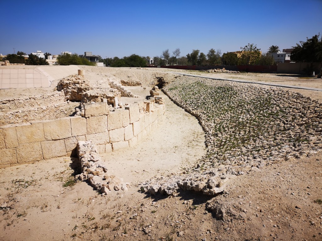
Reflecting about the research work required for this week’s challenge, I have looked for the unnoticed in my street. That unnoticed was a very famous temple which changed my perspective of archaeological sights in Bahrain. And it is just a few miles away from home! I have used the camera on my phone to capture images of my exploration journey and the video feature. I have also used the internet to find out more about its history. I have asked about what is available in the area from the local primarily my wife. I have really seen this area multiple times as this is my daily route going to work, coming back home, or going anywhere. However, today I have seen the temple area from a very different perspective as if it’s my first time to visit the area. I have walked to it, then tried driving to it. I have measured the distance from my street to the temple. I have taken images and video footage of the whole thing.
Studio Practice – Barbar Temple
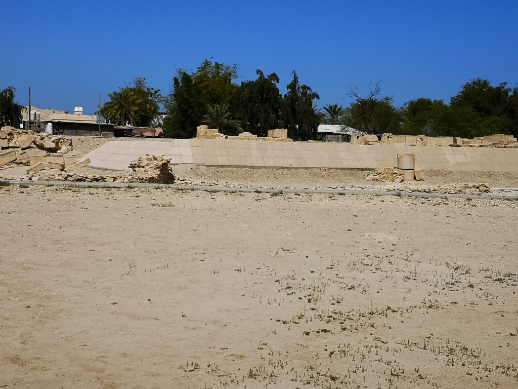
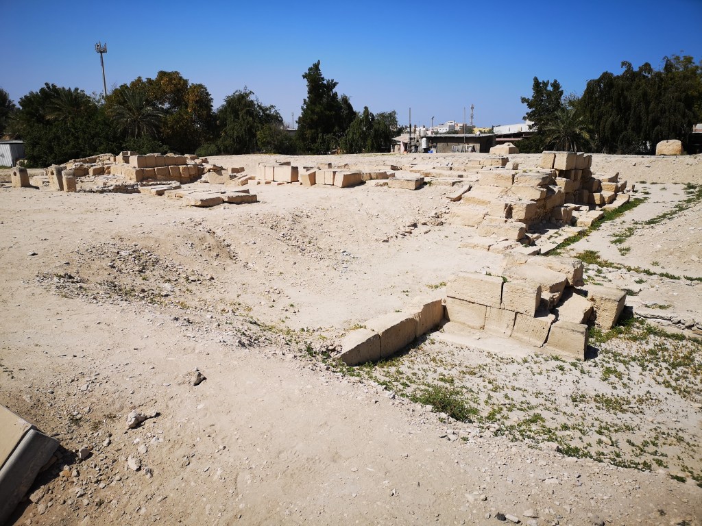
I have been living in the Kingdom of Bahrain for the past 12 years. About 5 years ago, my wife and I bought a very nice villa in the area of Barbar. Barbar is a village in the north of Bahrain. The Dilmun era Barbar Temple is in the village and is on the tentative list of UNESCO World Heritage Sites.
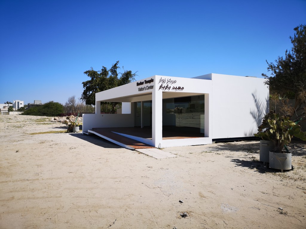
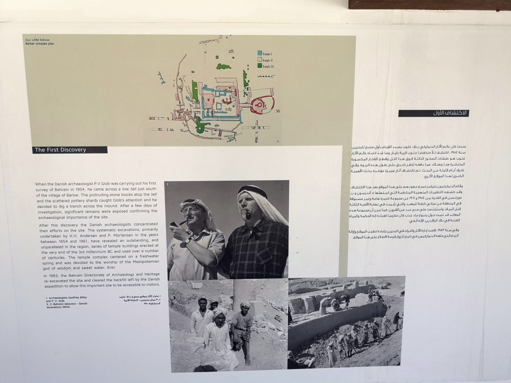
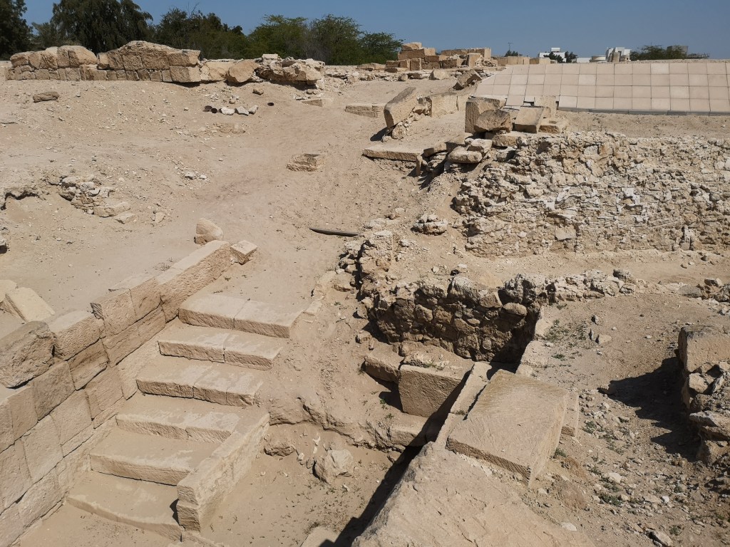
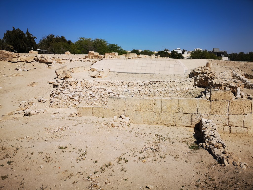
I have chosen to investigate this unique location which I have never noticed nor visited before and its just across the street from my compound area. The Barbar Temple is an archaeological site located in the village of Barbar, Bahrain, and is part of the Dilmun culture. The most recent of the three Barbar temples was rediscovered by a Danish archaeological team in 1954.
https://en.wikipedia.org/wiki/Barbar_Temple
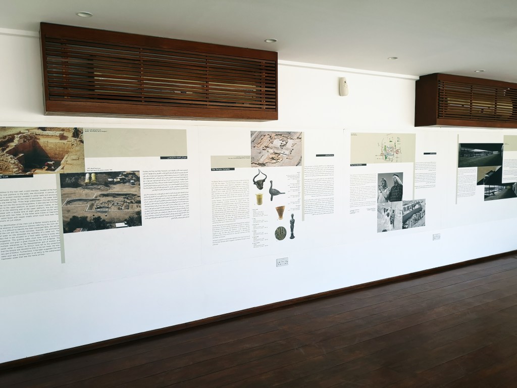
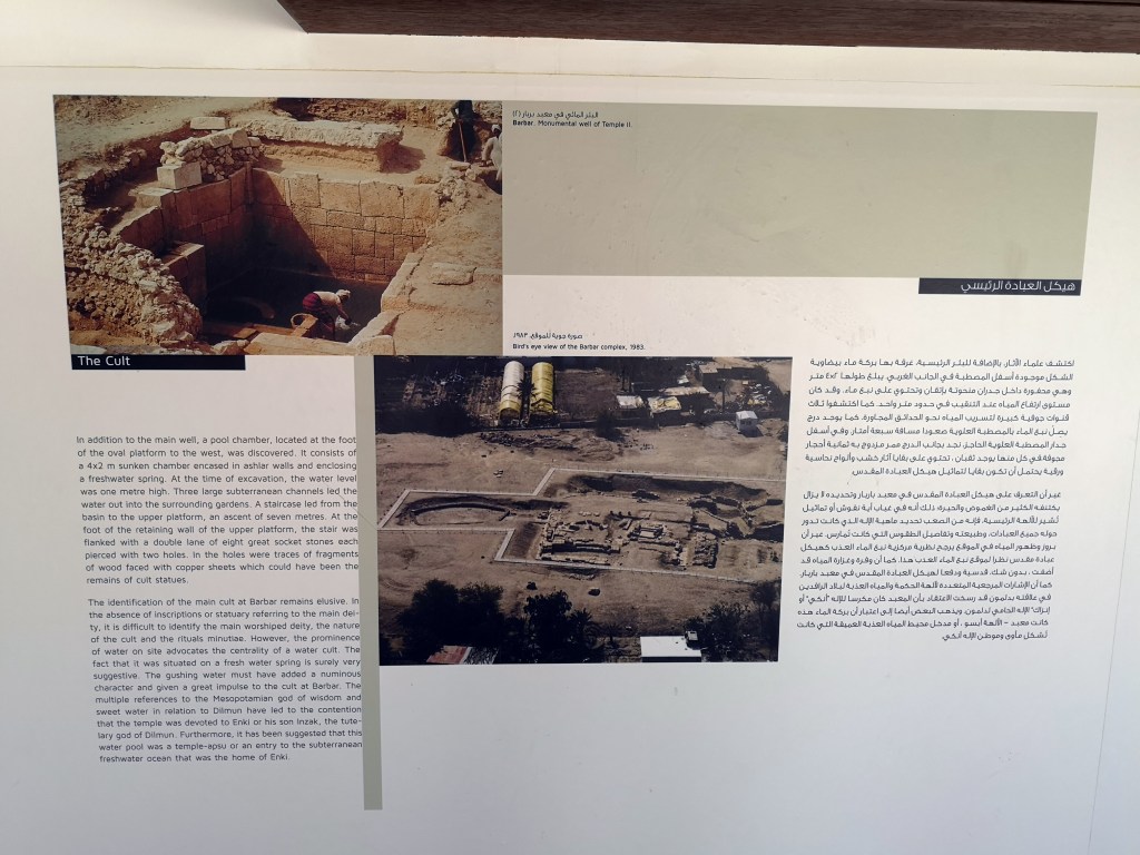
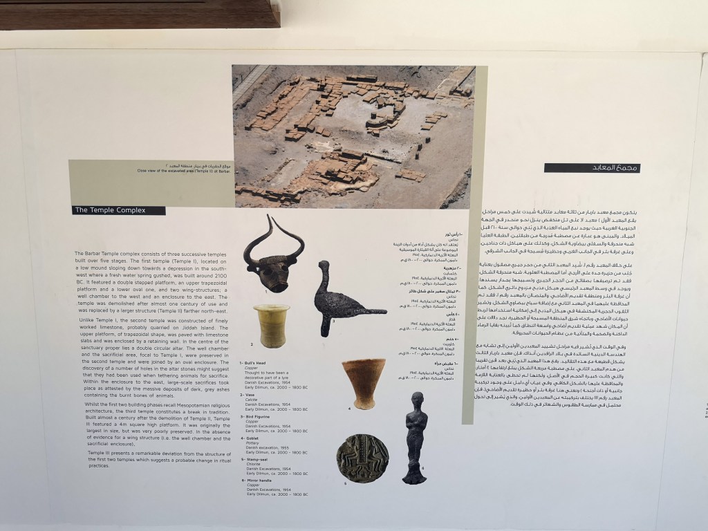
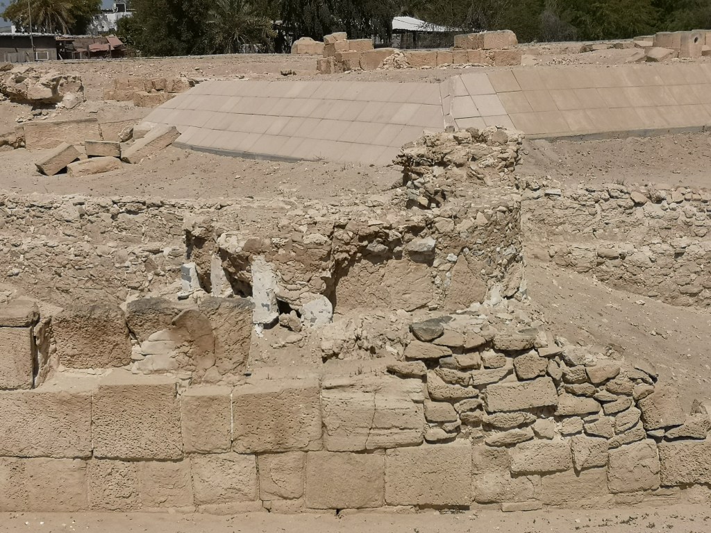
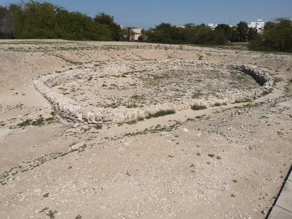
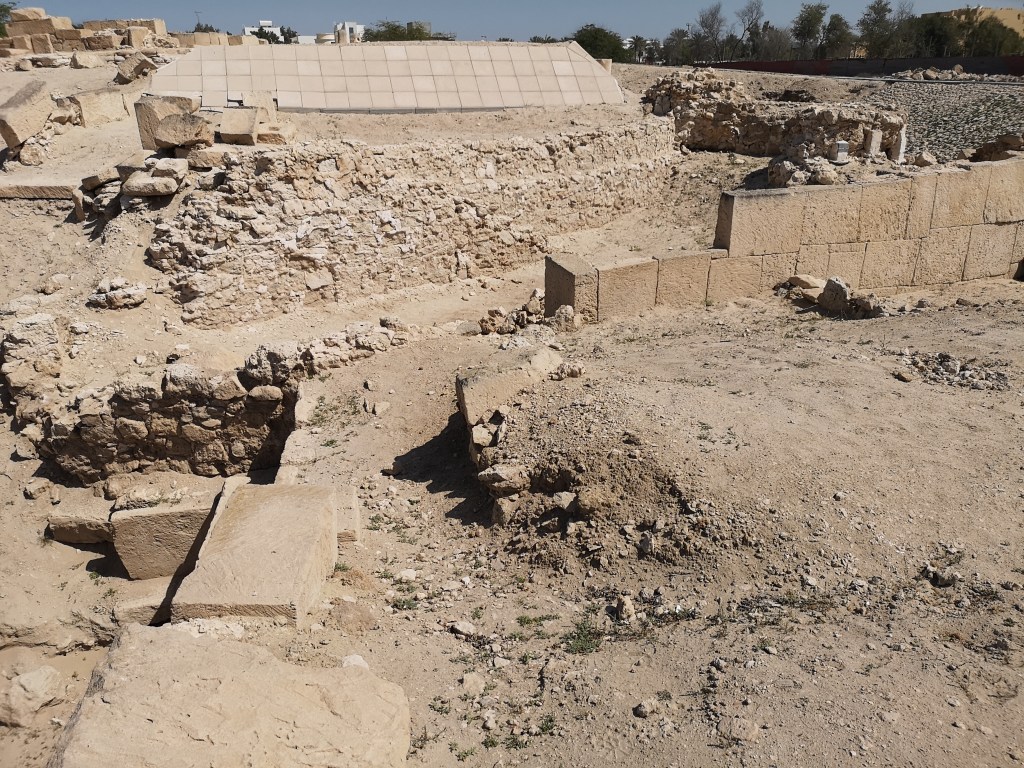
“The Barbar Temple is actually three temples, one succeeding the other on the same site. The two oldest temples are terraced with a central platform above an outer oval platform, an architectural feature comparable with Sumerian temples. The Barbar Temples, built in the third and second millennia BC, are among the most remarkable architectural survivals of the ancient world and are without parallel in the region.”
It is thought that the temples were constructed to worship the god Enki, the god of wisdom and freshwater, and his wife Nankhur Sak. The temple contains two altars and a natural water spring that is thought to have held spiritual significance for the worshipers. During the excavation of the site many tools, weapons, pottery and small pieces of gold were found which are now on display in the Bahrain National Museum. The most famous find was a bronze bull’s head.
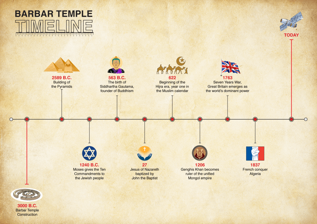
What makes Barbar Temple so unique is it’s age. It dates back to 3000 B.C.
To put that into perspective, I’ve designed a timeline with some important historical events between 3000 B.C. and today:
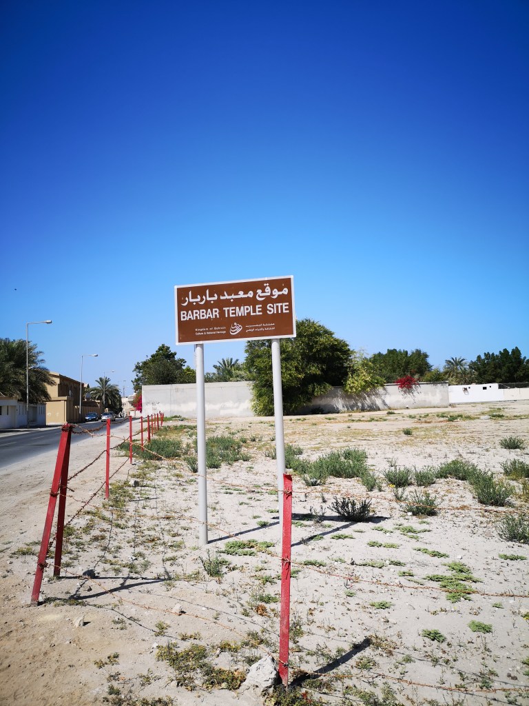
Despite The Barbar Temple being an archaeological site, the place is rather ignored by locals and tourists. The reason being, I believe it is because it is called a “temple” and the majority of the country’s religion are Muslims and Christians. Another reason could be, the place has no signs indicating it is archaeological. I only noticed when I went out trying to spot something I’ve been ignoring.
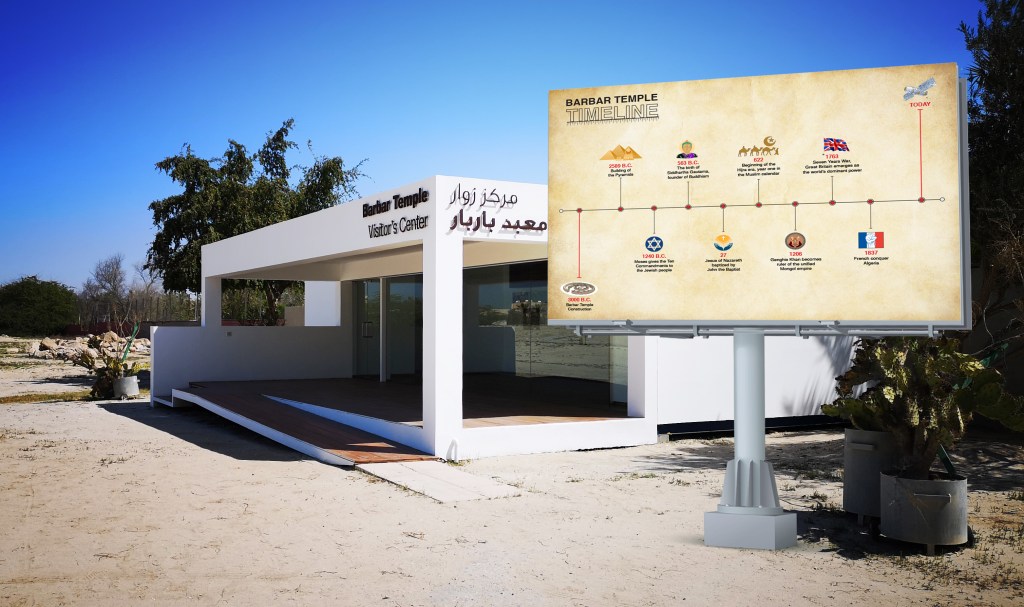
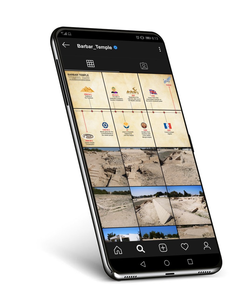
One way of making the Barbar Temple less unnoticeable, is through marketing (Social media, tourists guides leaflets on airports etc.). The timeline is a piece of information that makes the site more interesting, therefore it should be very prominent inside the site itself.
Below a video I recorded driving from my house to the site.
Omar Mal
March 2, 2020
