Lecture – Development
Going through the Podcast interview for the week, I mostly related to Vince Frost from Frost Collective. I reflect a lot of my designs and I think of them all the time. I keep tweaking them and altering them (usually having multiple trial attempts) until I am personally satisfied with an outcome that I’m happy with. This satisfied outcome is revealed to me by seeing that is the best solution to the self-initiated project in hand.
I do agree with Veronica that her personal ambition did influence the outcome of her opening the shop. I also believe that sometimes not all online designs can be clearly experienced until it does offline. You need the brand to be experienced physically and to create an emotional connection with it. Due to the pandemic, we all turned to online or digital channels to order our products and services. However, prior to that, we have already established emotional attachments to certain brands we like. Now, we just continue buying them but in a different manner. The risk is very high as you would need funding or sponsorship for this project. This also affects the quality of the outcome as it could be correlated with budgets.
Resources – Design Indaba (2016) Erik Kessels on the Power of Failure
There are many attempts taken and mostly failed, however at the end, you learn from your mistakes and this creates your experience in the field. As much as the business world seems to admire design innovation these days, very few companies are doing it well. It’s common to hear of companies hiring a creative consultancy, applying its recommendations, and yet at the end of the contract, seeing little or no return on investment. Most engagements that end this way have resulted in solutions that were never implemented or were not implemented to their full potential. The design failed, in other words.
My observations of attempts at design innovation in the business world suggest that this track record is typical. It can lead thoughtful executives to view design hype with skepticism and suspect a case of winner’s bias. But there are strong similarities among companies that use design effectively, and it’s not that they hired the “right” consultancy or believed in the power of design more than their competitors. Design failures are rarely the result of a bad concept or an unwilling. What sets them apart is an alignment of expectations. These companies go into the design process with a clear understanding of the role they must play, and a willingness to let their business be transformed by it.
The truth is there’s only so much designers can do on their own to make a company successfully innovative. Companies that misalign their expectations generally fail. They genuinely want good design, and they want it to impact their bottom line, but they want it to take place externally. Their vision of design as a purely third-party service is doomed.
Good design can indeed lift a company’s performance from lackluster to outstanding, but it’s still just one element in the overall system. The key to getting what you need from design is letting it influence, and be influenced by, the other elements in that system. Only when design considerations are integrated into your company’s culture as thoroughly as quality, schedule and budget are, will you start moving down the path of design-driven success.
(Source: https://hbr.org/2011/04/five-ways-to-fail-at-design)
Workshop Challenge
Usually these kinds of projects take many weeks to develop, however I tried to do the best I can within the deadline time span. After getting comments from my peers, I finally chose to go with the Saker Falcon option for the logo. I started sketching the falcon and after several trials realized that I wanted to focus on the head part and incorporate it in the logo. Then, I started to work on the shape that would be encompassing the head of the falcon and added the team’s name.
After thinking more about it. I felt that the number 5 was too shy in the logo and needed to stand out more. Hence you can see in the second batch of sketches that the digit 5 was made bigger and more the hero of the logo. Then I tried with several attempts to test out different placements for the team’s name within the big 5.
My next attempts went into incorporating the Saker Falcon as the hero, but this time incorporating the patriotic element which the flag and its colors of white and red. Also, I brought in the element of golden because Bahrain is well known for its gold. Then I attempted to play with several sketches and finally decided to incorporate the 5 zigzag designs of the flag at the back of the falcon’s head.
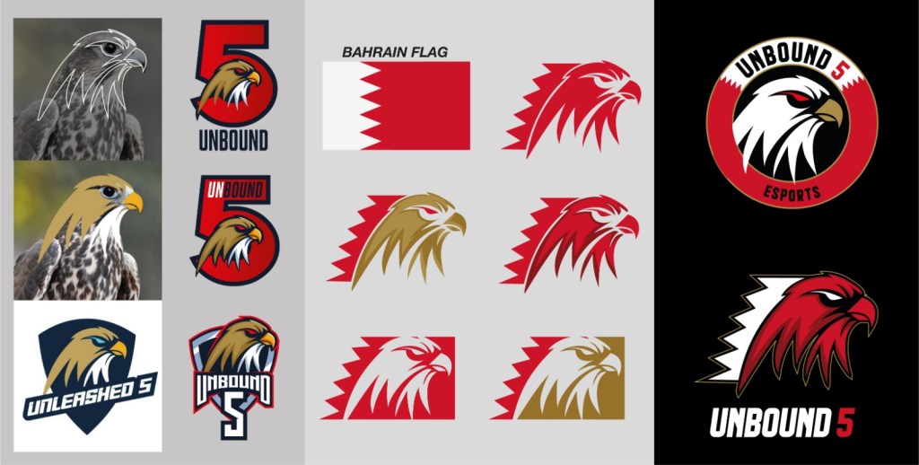
Afterwards, I played around with circle incorporating the falcon’s head or leaving it stand along. Then I started playing with the color of the falcon’s head between white, red, or gold. Even though the logo was traced and originally made, I still feel that the Falcon’s head has a Shutterstock feel to it.
Design Failures
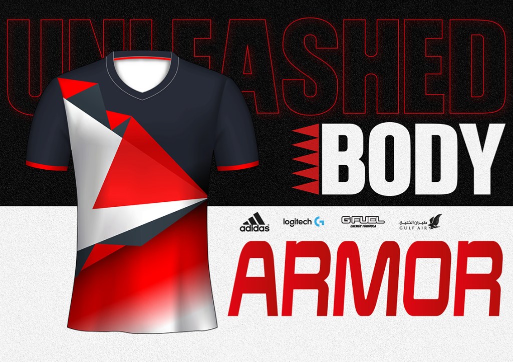

Midway in my several attempts, I was convinced with the logo where the digit 5 was the hero. Then I started to design other collaterals according to the that. However, after finishing the set of adaptations, I still wasn’t satisfied with the result. The logo and colors didn’t feel strong enough to represent a strong and competitive team. I couldn’t visualize that feeling while using the 5 as the hero for the logo. At that moment, I realized that I need to test other options and play further with the logo sketches. I felt that my logo must be bold and daring. The collaterals looked really dull and didn’t utilize the colors that represent Bahrain. The issue I had in the beginning of the development of the identity was the colours, typeface and layout composition overall. It had an American feel to it, and it was not feeling patriotic like it should be.
The Final Development
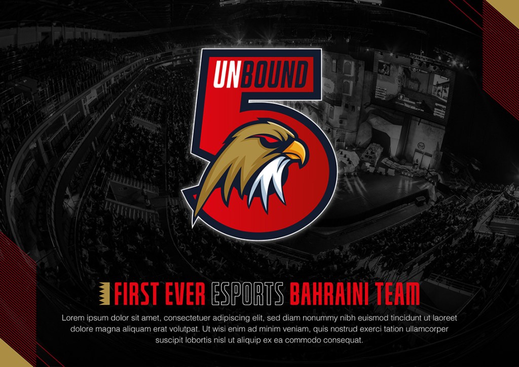
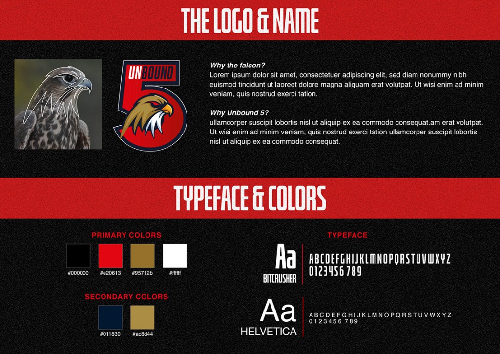
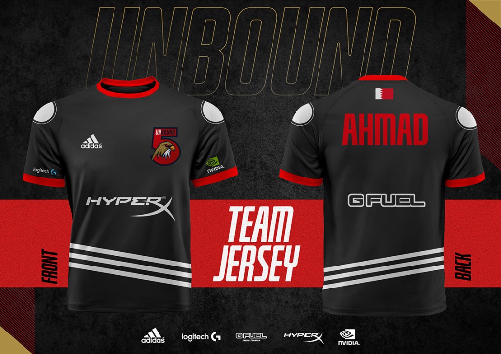
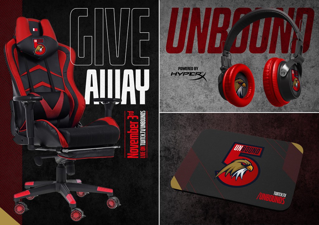
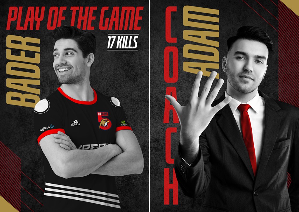
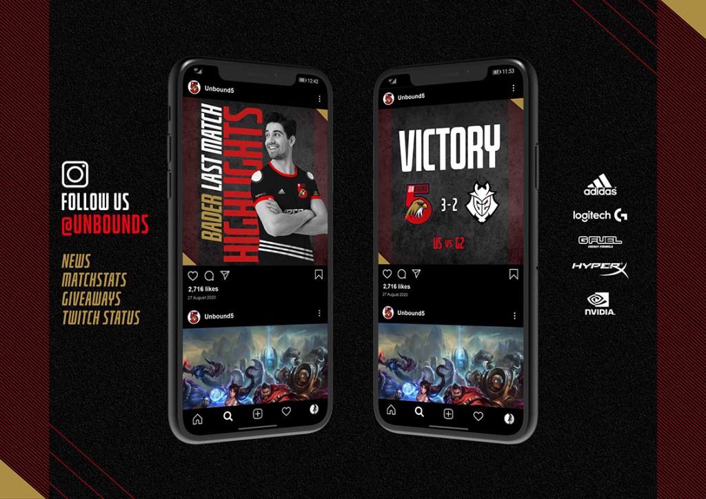
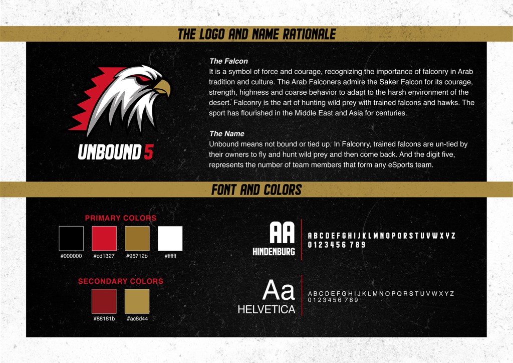
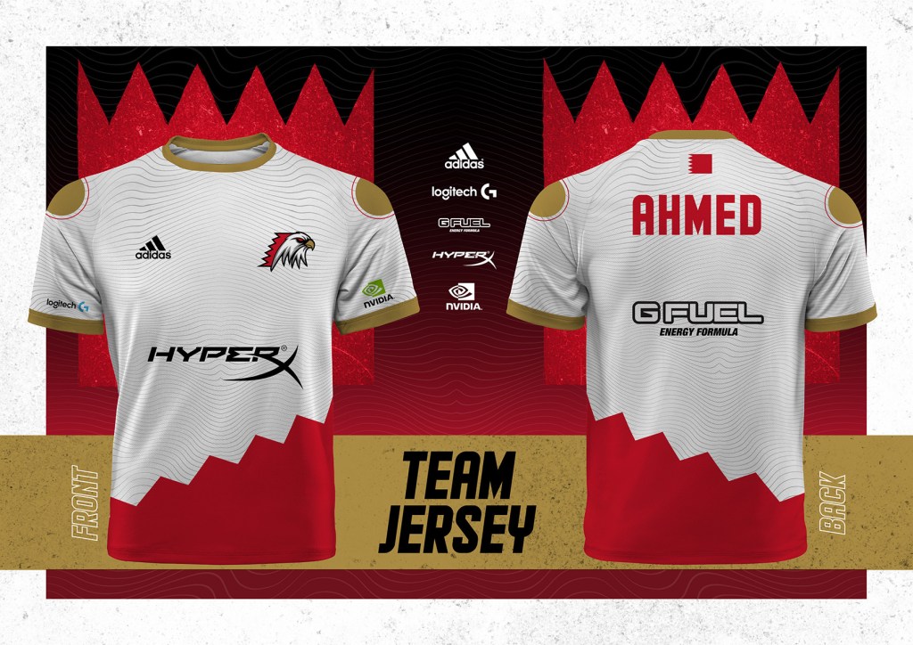
Despite not being 100% happy with the logo, I am somewhat satisfied with the presentation. I am utilising the colors of Bahrain, the red, white, black and gold. In addition to that, the hero of the logo is the falcon. Now the logo shows power, courage, boldness, and patriotism. The logo is culturally and emotionally relevant to Bahrainis. Even the name has a meaning to it. The jerseys are bold and fresh in colors.
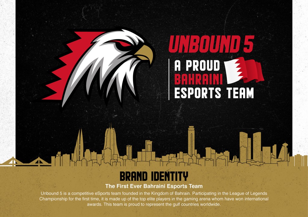

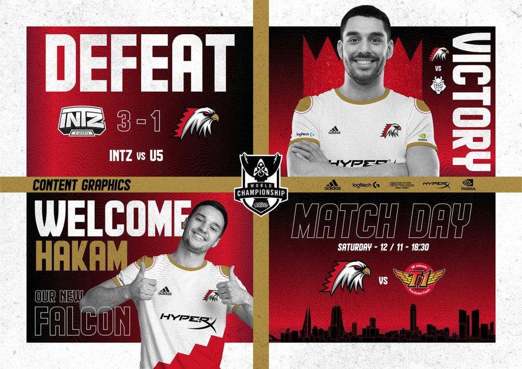
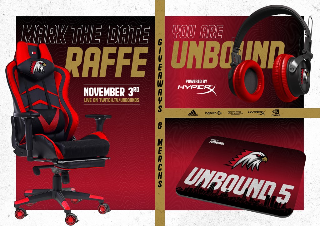
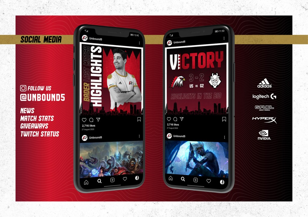
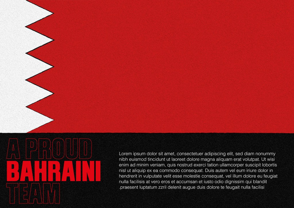
The presentation utilized the black color in the background to make the other colors stand out especially the golden. The Bahrain skyline in vector and the flag element gave a patriotic touch to the overall theme.
Omar Mal
October 6, 2020
