According to viseme.co blog, one of the common misconceptions about information design is its similarity to data visualization. The line of distinction is blurry, but this can help you better grasp the difference: Information design is data used as a storytelling tool. It is data with a purpose. Therefore, Information visualizations are more about informing the viewer about a data set and its specific parts. Conclusions have already been made for that data, and it is being presented in a snackable design.
Data visualizations are raw data visualized in a way that permits the viewer to make their own conclusions. They can also include data from a specific point in time and can be organized in a way that inspires a distinctive reaction. Nevertheless, it can still be analyzed and direct viewers to their own conclusions.
Often, information design goes hand in hand with user experience (UX) design. Not only must information be presented in a clear manner, but users also need to navigate the information without it being overwhelming or confusing. That is where the union of information design and UX design becomes inevitable. The basis of UX design is human-centered design. Meaning that everything is created with the user in mind. User experience design follows a design thinking process to get the best results.
Information and data are all around us. Everything we do collects data. For example, our devices are constantly collecting data about how we shop, communicate, what we like to do, how our health is, and what our life, in general, is like. Information design takes on an important role in this flow of data and information. It is essentially a way of putting together chunks of relevant information to make it easy to understand for users. Information design is often visual but can also be sensory. Some types are even physically interactive through sound and smell. The best examples also take accessibility into account.
The different types of information design can be separated into different categories. Below are a few:
- Curated information that follows a storyline. For example, infographics, IKEA manuals, recipe books.
- Searchable information that is viewed according to filters or search parameters. For example, search engines, websites, indexed reports.
- Educational resources, either static or interactive. For example, museum exhibits and displays, textbooks, online education portals.
- Visual and emotive information presented in a snackable way. For example, explainer videos, how-to video tutorials, documentaries.
- Wayfinding. For example, physical and digital maps, escape plans in hotels, touchscreen maps in malls, trail markers in national parks.
- Health and Safety. For example, hospital triage apps, patient medical histories in digital form, CT scans.
- Sensory information design. For example, music apps, 4D cinematic experiences, the smell of apple pie purposefully wafting outside of a bakery.
A few examples.
Encyclopedias and Yellow Pages
Before the internet, encyclopedias were the best way to find information about anything, fast. Just how the Yellow Pages were the best for finding businesses in your area. Both are examples of searchable information design in a print format.
Search Engines
Our digital, online equivalent of encyclopedias and yellow pages are search engines like Google, Bing, Yandex, etc.
Infographics
The first thing that comes to find for most people when they hear information design is infographics. These are visualizations that include a chosen set of data with a purpose.
Websites
Every single website is an example of information design. They are larger than an infographic but smaller than a search engine. The print equivalent of a website would be a brochure or catalog.
Manuals
The manuals that come with new appliances might not be the prettiest, but they’re still considered information design. IKEA and Apple manuals on the other hand are highly visual and emotive examples.
Explainer Videos
Explainer videos are another example of information design. They are moving infographics that tell a story plus incite the viewer to act.
Wayfinding Visuals
Wayfinding is the term that applies to all types of information design which helps people find their way. From Google maps to subway diagrams, any visualization that helps a user find a place on a map is also considered in this category.
Museum Exhibits
Every exhibit in a museum, especially the information panel, is considered information design. Examples of these range from a simple text panel to an interactive display. A highly sensorial example are the hands-on science and discovery museums for children.
Bullet Journals
A bullet journal is a daily agenda that people can personalize to their liking. Every single bullet journal is different, but their purpose is the same; tracking a person’s activities throughout the year. Bullet journals are personal information design projects.
Without information design, life would be boring. It is as simple as that.
Imagine this:
- Maps without color-coding or legends.
- Infographics would not exist.
- All websites would be the same.
- Textbooks would be drab and hard to follow.
Source: https://visme.co/blog/information-design/
According to Netquest.com blog, there are five advantages of data visualization.
Data visualization provides us with a quick, clear understanding of the information. Thanks to graphic representations, we can visualize large volumes of data in an understandable and coherent way, which in turn helps us comprehend the information and draw conclusions and insights. This helps us save time and lets us solve problems more efficiently.
Information design helps us identify emerging trends and act quickly based on what we see. These trends make more sense when they are graphically represented; that is, visuals and diagrams make it easier for us to detect highly correlated parameters. Some relationships are obvious, but others must be identified and highlighted to help our customers focus on a specific data point, which may influence the decisions they make.
The presentation of infographics and data enables us to identify relationships and patterns within digital assets, since discerning trends in the data gives us a competitive advantage when it comes to factors that may be affecting product quality, or that may help us solve larger problems.
Data storytelling allows us to develop a new business language so that we can share our story with others. It is a medium that enables us to easily create a narrative through graphics and diagrams, through which, with the help of visual analytics, we can uncover new insights and engage others.
Visualizing data provides us with analysis at various levels of detail. People want evidence of underlying analysis; even if they do not understand the breakdown of the analytics, they want evidence that there is data behind it, because these stories are more convincing than a mere personal experience.
Source: https://www.netquest.com/blog/en/five-advantages-of-data-visualization
Workshop Challenge
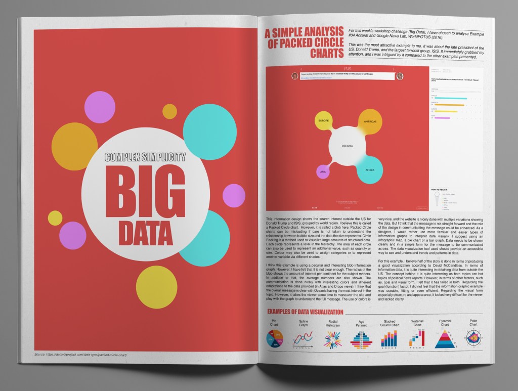
For this week’s workshop challenge (Big Data), I have chosen to analyse Example #04 Accurat and Google News Lab, WorldPOTUS (2016). This was the most attractive example to me. It was about the late president of the US, Donald Trump and the largest terrorist group, ISIS. It immediately grabbed my attention, and I was intrigued by it compared to the other examples presented.
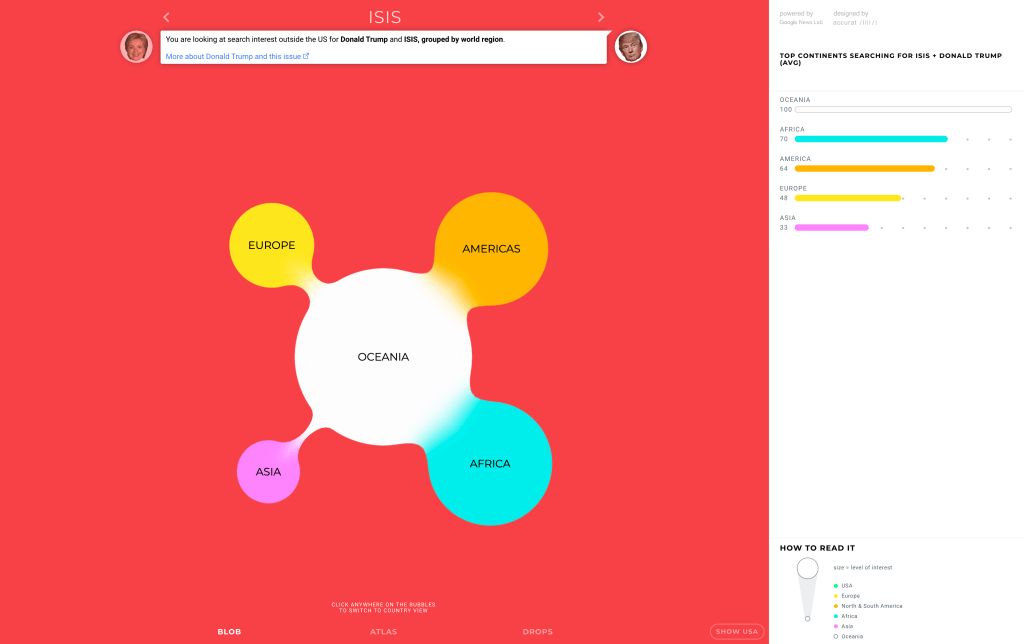
This information design shows the search interest outside the US for Donald Trump and ISIS, grouped by world region. I believe this is called a Packed Circle chart. However, it is called a blob here. Packed Circle charts can be misleading if care is not taken to understand the relationship between bubble size and the data the size represents. Circle Packing is a method used to visualize large amounts of structured data. Each circle represents a level in the hierarchy. The area of each circle can also be used to represent an additional value, such as quantity or size. Colour may also be used to assign categories or to represent another variable via different shades.
I think this example is using a peculiar and interesting blob information graph. However, I have felt that it is not clear enough. The radius of the blob shows the amount of interest per continent for the subject matters. In addition to that, the average numbers are also shown. The communication is done nicely with interesting colors and different adaptations to the data provided (in Atlas and Drops views). I think that the overall message is clear with Oceania having the most interest in the topic. However, it takes the viewer some time to maneuver the site and play with the graph to understand the full message. The use of colors is very nice, and the website is nicely done with multiple variations showing the data. But I think that the message is not straight forward and the role of the design in communicating the message could be enhanced. As a designer, I would rather use more familiar and easier types of information graphs to interpret data visually. I suggest using an infographic map, a pie chart or a bar graph. Data needs to be shown clearly and in a simple form for the message to be communicated across. The data visualization tool used should provide an accessible way to see and understand trends and patterns in data. For this example, I believe half of the story is done in terms of producing a good visualization according to David McCandless. In terms of information data, it is quite interesting in obtaining data from outside the US. The concept behind it is quite interesting as both topics are hot topics of political news reports. However, in terms of other factors, such as, goal and visual form, I felt that it has failed in both. Regarding the goal (function) factor, I did not feel that the information graphic example was useable, fitting or even efficient. Regarding the visual form especially structure and appearance, it looked very difficult for the viewer and lacked clarity.
Omar Mal,
February 10, 2021
