Typography
This week’s lecture introduces typography, explores examples of type design and applications of type. It compares hand and machine, structure and hierarchy, tension and space, tone of voice and more. It also explores the appropriateness of how form and material contribute to the overall message. This topic is very interesting, so I decided to research into the history of typography.
Writing is one of the most fundamental forms of communication, and it traces its roots back to hieroglyphs or pictograms. Used by ancient civilizations of the world to represent ideas, these images soon evolved into alphabets and phonographic writing, which led to the development of various typographic systems.
Ancient cave paintings that date back to 20,000 B.C. are perhaps the very first recorded written communication. However, formal writing is said to have been developed by the Sumerians at around 3,500 B.C. As civilizations advanced, the need to communicate complex concepts grew—hence the development of Egyptian hieroglyphics. By 3,100 B.C., the Egyptians began incorporating symbols or ideograms into their art, architecture and writings.
Also, by 1,600 B.C. Phoenicians developed phonograms, or symbols used to represent spoken words. It is Phoenicians who are credited with creating the very first alphabet and around 1,000 B.C.—the same alphabet was used by the Greeks. In fact, the word Alphabet is a combination of the first two Greek letters, Alpha and Beta. The Romans, after several years, used this Greek Alphabet and styled the Uppercase Alphabet, which is still used today. They also refined the art of handwriting and fashioned several different styles of lettering.
The Middle Ages were all about hand-written and well-illustrated manuscripts. It led to the evolution of a wide range of writing styles. The art of Calligraphy along with page layout and lettering risen. Calligraphy masters travelled across the known world to share their knowledge with the educated elite.
The development of moveable type and the printing press in the 15th century by Johannes Gutenberg was a turning point for the modern world—and modern typography. By the Industrial Revolution typography was all about communicating with the masses. Through signs, posters, newspapers, periodicals and advertisements, typefaces became larger and catchier, with bolder lettering and shading—as well as experimental serif and sans serif typefaces. Ornamental typography was another major highlight in this era.
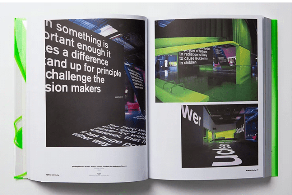
The practically endless body of work that represents typography makes it impossible for graphic designers nowadays to become familiar with each typeface design that exists. However, it is important that to be well-versed in typographic styles, iconic typefaces from the past, and the origins of common typefaces. A strong foundational understanding of typographic history helps designers understand and meet the needs of their clients more effectively. Typography is all about adjusting the text within the design while creating powerful content. It provides attractive appearance and preserves the aesthetic value of your content. It plays a vital role in setting the overall tone of your website and ensures a great user experience. There are five basic classifications of typefaces: serif, sans serif, script, monospaced, and display. As a rule, serif and sans serif typefaces are used for either body copy or headlines (including titles, logos, etc.), while script and display typefaces are only used for headlines.
Resources
Kubel, H. and Williams, S., (2015) Type: New Perspectives in Typography
The book showcases exemplary examples of typography with essays in all things letters, like Rick Poynor and Paul Shaw, who gives a delightful sort of cheat sheet in the form of an overview of 20th Century type design.
Looking at the pictures, with work from graphic design talents like Bob Gill and David Pearson sitting alongside artists like Martin Creed, whose work we wouldn’t perhaps usually associate with straight up type design, but who draw on lettering as a major part of their practice. This book reinforces the amazing power of typography.
Baines, P. and Haslam, A., (2005) Type & Typography
This structured text takes the reader through every aspect of typography, from the history of language and writing systems to the invention of movable type and the evolution of the digital systems of today. It provides an overview of the bewildering variety of typefaces available and is a practical guide to using type as a meaningful element of design in all media. I really enjoyed exploring this book and would actually go and by a copy for myself.
Workshop Challenge
Digital Sketches

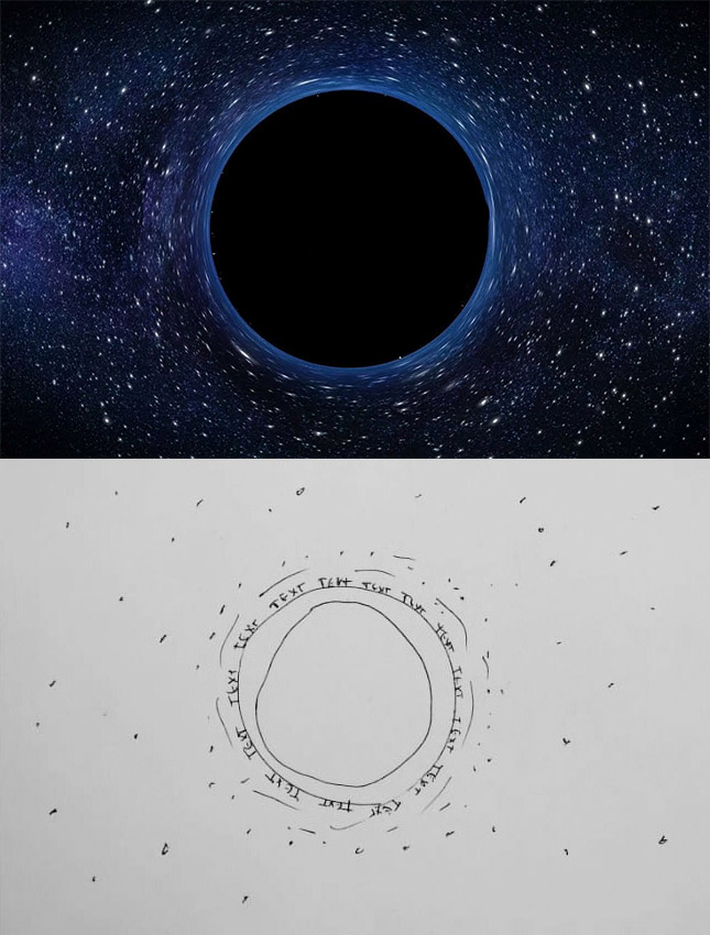
I wasn’t sure where I was going with this, until I did further research and then I decided to take a scientific approach and I will be doing my week 10 around the poem by Jonathan Taylor. Jonathan is a Senior Lecturer in Creative Writing at the University of Leicester.
We are hemmed in by nothingness,
black holes to the left of us,
dark matter to the right of us,
a cosmic valley of death,
a galaxy of tombstones.
Telescopes decipher inscriptions
carved black on black:
like Ebeneezer gazing at his future
we find our own names there.
We are hemmed in by nothingness,
dark matter to the left of us,
black holes to the right of us,
a quiet cemetery of stars
where nebulae grow like yew trees,
solar systems like lichen.
– Jonathan Taylor
Source:
https://chandra.harvard.edu/blog/node/611


Omar Mal
March 29, 2020
